It’s Saint Patrick’s Day. Did you wear green today?
All of us here at 17hats did! After all, green is our primary brand color.
Let me use St. Paddy’s Day as a fun reason to explore brand colors: what they are, why they matter, and a concrete example to illustrate the concept (yep, 17hats).
What are brand colors, anyway?
Let’s start with this more basic question first: What’s a brand?
If you ask me, a brand is a promise. It’s a promise that’s conveyed by everything that you do and communicate as a small business.
That’s where the concept of a visual identity comes in. Your look and feel should be consistent across all touchpoints – that recurring look and feel is your visual identity. This includes your company logo, your use of typography, and – you guessed it – your color scheme.
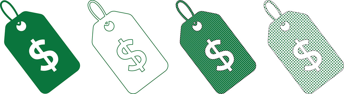
Most successful brands adopt one or more colors that they use consistently. Often, companies choose a primary color and one or more secondary colors. This go-to color palette is often written down and referred to as the official “brand colors.”
Think about it for a minute. Sure, there are various shades of red and yellow, but you only see two precise hues associated with McDonald’s. (There are color catalogs, such as the Pantone Matching System, to pinpoint exact shades of color.)
In today’s digital-first world, it’s particularly important that you choose a color scheme and stick with it. When someone receives an email from your small business, they should recognize in an instant – Hey, I know those colors, I know that company – that it’s from you.
What colors convey
Whether you’re talking about Christmas, the Fourth of July, or a gender reveal party, colors have meaning. And it’s no different in the world of branding.
In fact, if anything, color can take on an outsized role when it comes to communicating, at a glance, what your brand is all about.
Some of that is intuitive. Think about yellow for a second. Maybe it reminds you of sunshine, or daisies. Now, how does yellow – as a color – make you feel? For most people, yellow conjures up feelings of happiness or optimism. Cheerful people are even referred to as having a “sunny disposition.”
Every color has its own associations like this. These cultural connections to color inform why brands opt for certain colors.
If you Google “brand color wheel,” your screen will be filled with colorful pinwheels. These color wheels offer helpful adjectives to describe what go-to colors say most often. Many also associate those colors and personalities with well-known brands as examples.
For instance:
- Blue is often associated with hope, loyalty, awareness, ambition, and progress. Brands such as P&G, Intel, Gap, Twitter, and Facebook use blue as their primary color.
- Orange is warm, joyful, creative, fun, and friendly. Consider what orange does for Fanta, Dunkin’, Nickelodeon, and The Home Depot.
- Red conveys excitement, passion, boldness, and energy. Many brands mine the meanings of red as their primary color, including ESPN, Adobe, Netflix, Virgin, and Toyota.
Of course, lots of brands embrace a combination of colors. So Gatorade can signal both renewal (green) and fun (orange) as part of its lightning bolt logo. And McDonald’s, mentioned earlier, claims both the excitement of red and the optimism of yellow when the golden arches appear on its red background.
Case in point: 17hats
Some of you out there might be starting up your own business, and thinking about which colors to use for your logo, website, and business cards. Others may already have an up-and-running small business, but you may be considering an update to your brand colors.
Obviously, it’s hard to generalize for all the service-driven small businesses out there. But I can unpack an example: Here’s the thinking behind our choice of green as the primary brand color for 17hats.
Green is the color of money in the United States, and it’s often associated with commerce and prosperity. So that part was a no-brainer. Since 17hats exists to help small businesses prosper, green was a natural place to start.
Green also implies growth (think plants and seedlings), which is a natural fit for a company seeking to help small businesses thrive.
Finally, brands such as Sprite, Tic Tac, and Subway leverage green to convey freshness. We like to think that 17hats is a fresh approach to managing business better, so that was another factor that favored green as our primary color.
Of course, your business – whether it’s dog walking, balloon artistry, or boudoir photography – may take your mind to vastly different places, with completely different color cues.
The bigger point is that colors have a breadth and depth of meaning. Choose your brand color (or brand colors) with those positive attributes in mind, and then maintain consistency. Build equity in your brand colors by using them again and again. (Remember, you will get tired of your brand colors loooooong before your customers even remember them, so stay consistent!)
The right brand colors can give your small business a great head start toward a visual identity and brand personality that people feel drawn to.
Latest Posts

How to Run a Client Experience Audit (Step-by-Step)
July 22, 2026
5 Ways Manual Processes Are Quietly Costing You Money
July 21, 2026