Thinking about running a sale for your small business? With Black Friday, Small Business Saturday, and Cyber Monday around the corner, there’s no time to waste when it comes to planning.
You’ve realized by now that there’s more to planning and prepping for a sale offering than simply posting it on social media. Still not sure about your offer? Check out Amanda Rae’s latest blog post: Black Friday and Small Business Saturday: Deal or No Deal? to determine if a sale is right for your business.
Once you have a plan for what you’ll offer, you need to decide how to present your offer. The first item on your list should be building an effective landing page for your sale.
What’s a landing page?
A landing page is a stand-alone web page, oftentimes separate from your business website entirely. The sole objective of a landing page is to turn visitors into customers.
The average attention span of a human is less than a goldfish. Blub, blub. (Yeah, for real). So unless your target audience is a fish … your sale landing page should have a clear message, simple navigation, and a trustworthy sign-up or buying option.
Here are a few dos and don’ts when it comes to building a landing page for your sale.
Do make your sale offering simple.
Cut to the chase. Give a clear explanation of your sale offering. Use a simple and effective headline, and easy-to-read copy. It’s proven that conversion rates go up when you’re clear about what you’re offering.
Do keep your message and design on brand.
It’s important that visitors who may be familiar with your brand recognize that it’s your business when viewing your landing page. It’s best to stick with your brand colors, fonts, and other design standards when laying out the landing page.
In addition to being clear, your message should be on brand. Tailor the message to what you’re offering. Your target audience should feel like you’re speaking directly to them.
Do use only one call to action.
This is the whole point of your landing page is to get your visitors to do one thing. CONVERT! So, don’t ask them to take more than one action on your landing page or link out to other pages.
Have a form or button in an easy-to-see location. If you’re using a form, keep it short and simple. Sign up with less than five questions. If you’re using a buy now or booking button, make sure they know where that link is taking them. Don’t use “Click Here” – use “Buy Now” or “Book Now.”
Do consider using a video to go into more details about your offer.
Have more to say that won’t fit into your design? Embed a video that allows you to drive home your message and provide value to your visitor.
The key here is to embed your video so users do not have to leave the landing page to watch.
Do add real client testimonials to your page for social proof.
Social proof is one of the most important factors when a consumer is deciding to buy a product or service. Show off real happy clients to get more happy clients.
Do keep all your important information “above the fold” of your landing page.
What does “above the fold” mean? When newspapers were cool, the most important stories (or highest paid advertisements) were placed above where the newspaper folded in half because the top was read first. In website terms, it means to keep the most important information at the top of the website before a user has to scroll.
Do use a reputable and trustworthy platform and domain name for your landing page.
There are so many DIY landing page design platforms, or you can use your own website builder to design a beautiful landing page. One of the reasons I love the World Wide Web is that your small business can look and feel just as great, or better, than any Fortune 500 company.
Also, the domain name you use needs to be trustworthy. Heed caution when using link shorteners like bit.ly, as it’s becoming more common for spammers to use those to direct users into the unknown. Consumers are becoming more wary of those links when they can’t see where it’s taking them. Consider using a subdomain (for example, sale.yourdomainname.com), or purchase a new domain name entirely, specifically for your sale.
Don’t get caught up in all the fancy widgets and plug-ins that clutter your landing page.
Some website page builders have some awesome add-ons to use. But it’s important to consider your target audience and think about what they will best respond to. Keep it simple with one easy step to sign up or buy.
Don’t use more than three selling points in the copy of your landing page.
You might think adding more information about your service is better. However, it actually cuts down your conversion rate. “But there are so many good things to say” … No. Stick with three selling points that are easy to understand at a glance.
Write and rewrite your copy to be sure you’re being clear enough to your potential client. Use a copywriting tool like Hemingway App to check punctuation, spelling, and readability. It’s free!
Don’t over complicate the offer or offer too many options.
Before you design your landing page, you should know the goal that you want visitors to accomplish. Your offer should align with this goal and be crystal clear. Offering alternatives or additional add-ons to a purchase can get muddy and distract the potential client from the end goal.
Don’t make it hard for your visitors to purchase or sign up.
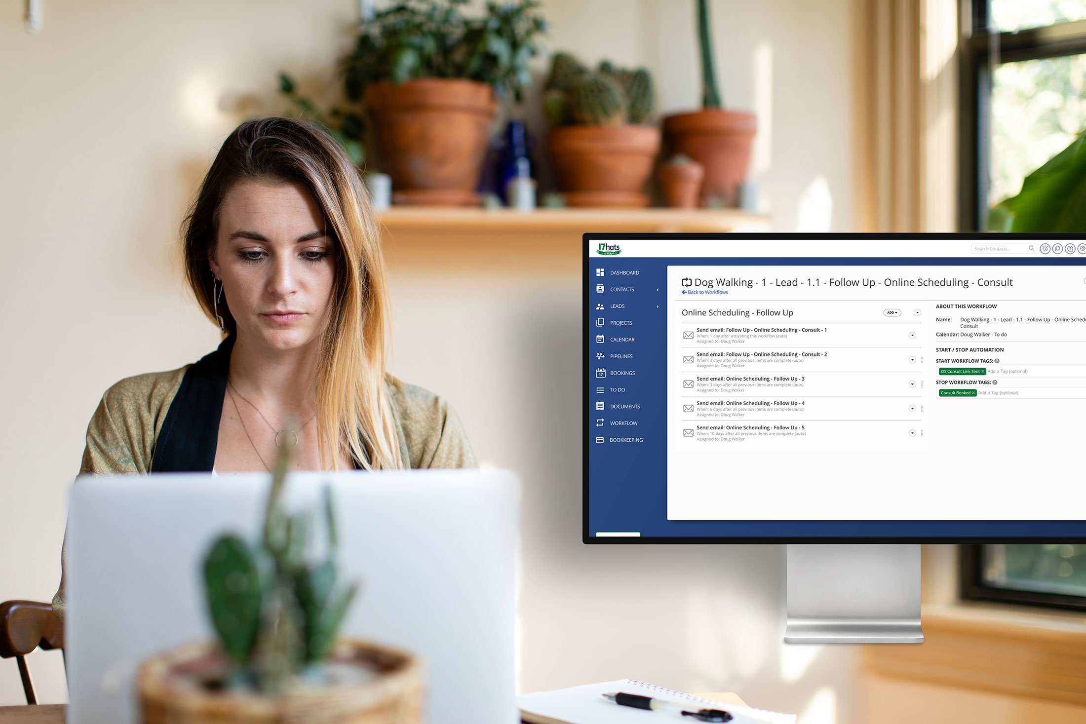
Instead your call to action should take one step. Embed your Lead Capture Form or link your Online Booking calendar directly to the landing page. Ask no more than a few questions on your sign-up form. With 17hats, you can set up a Workflow that automatically emails them a Questionnaire to gather more information.
Don’t forget to make sure your landing page is mobile-friendly.
Need I say more? I don’t need to look at your website’s Google Analytics to know that more than 50% of your website traffic comes from mobile devices. In case you didn’t know … 66% of all website visits came from mobile devices in 2020.
When you build your landing page, be sure to preview it in a mobile format. You may need to adjust your design or copy for optimized mobile viewing.
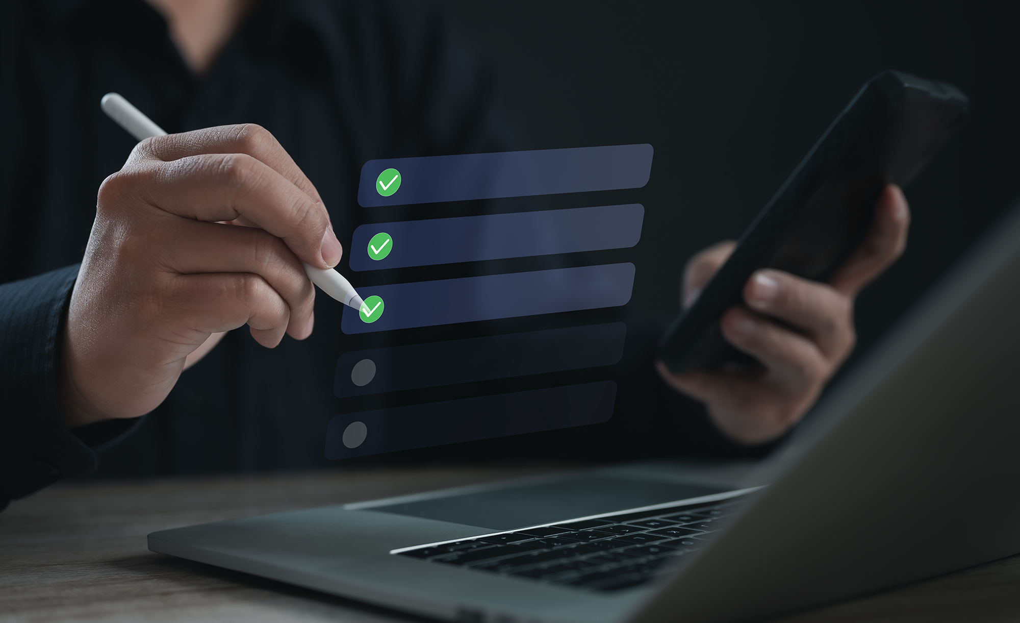
Now what? Test!
Now that you’ve completed building your landing page, don’t forget to test it. Some landing page platforms have fancy built-in A/B testing features or dynamic content features that automatically gather results of what headline, image, etc., works the best to convert landing page visitors.
Does this apply to other types of Landing Page Design?
Yes! Do you have a lead generation freebie or online course that you offer? Use these same basic principles to enhance any landing page design you have.
How can 17hats help you with your sale offering?
- Lead Capture Forms
- Gift Card Sales
- Online Booking
Learn about each of these through 17hatsUniversity.com webinar replays and tutorials.
The key takeaways
Follow the simple recommendations to build a landing page that converts visitors into happy paying clients. Just a few things to remember:
- Be clear
- Keep it simple
- Make it easy
Good luck with your future sale!
Latest Posts


Best Moxie Alternatives for Service Businesses
March 18, 2026